Blog
AI website builders like Lovable: the hidden costs
Lovable, Bolt and v0 can draft a site in minutes. If you're not technical, here's the work, risk and upkeep between that draft and a page that works.
Tools like Lovable, Bolt and v0 let you describe a website in plain English and watch it appear a minute later. For a small business owner who has put off getting online, that is exciting.
It is also where a lot of people get stuck. The first draft arrives fast. Turning it into a page that loads quickly, shows up on Google, collects leads reliably and keeps working next year is a different job, and the tool does not tell you which parts are missing.
This post is about that gap: what it costs in time, money and risk when someone without web experience builds and launches a site with an AI builder. It is not an argument against the tools. In the right hands they are excellent, and we will be specific about when they are the right choice.
The short answer
- AI builders are a great fit for prototypes, internal tools, testing an idea before you invest, and founders who can read code or know what to check.
- They get expensive when the person prompting cannot see what is wrong: the draft looks finished, but search setup, performance, accessibility, forms, security and hosting still need someone who knows what to look for.
- The problem is missing expertise, not the tool. An AI builder speeds up whoever is using it. It does not add judgment that was not there.
“Almost done” is not done
The first version usually looks impressive: a hero, a few sections, a contact form, a footer. Then the real requests start. Move this section. Make the phone number clickable. Fix the menu on mobile. Change the color without breaking the buttons.
Each request is a new prompt, and each change can quietly undo something that worked before. Without a way to read the code, you end up in a loop: describe the problem, check the result, describe the new problem. The last 20% of the work tends to take most of the time, and that is the part a demo video never shows.
Usage-based pricing adds up
These tools charge for how much you use the AI, not just for a flat seat:
- Lovable prices its plans by credits, and each message to the AI uses credits based on how complex the task is.
- Bolt uses tokens, and its own pricing page notes that larger projects use more tokens per message.
- v0 combines included monthly credits with token-based usage on top.
None of this is hidden. The catch is that fixing problems also costs credits. Someone who knows exactly what to ask spends a little. Someone going in circles over a broken layout can burn through a month’s allowance in an evening, then buy more. Add a paid plan for a custom domain and the “cheap” option starts to look like a subscription you will keep paying.
Generic design and copy do not convert
AI builders are trained to produce something that looks reasonable for any business. That is exactly the problem. Visitors have seen the same rounded cards, the same purple-to-blue gradients and the same headlines (“Transform your business with…”) hundreds of times.
Here is what that looks like. We made the page below for a fictional wellness business, using the patterns these tools tend to reach for:
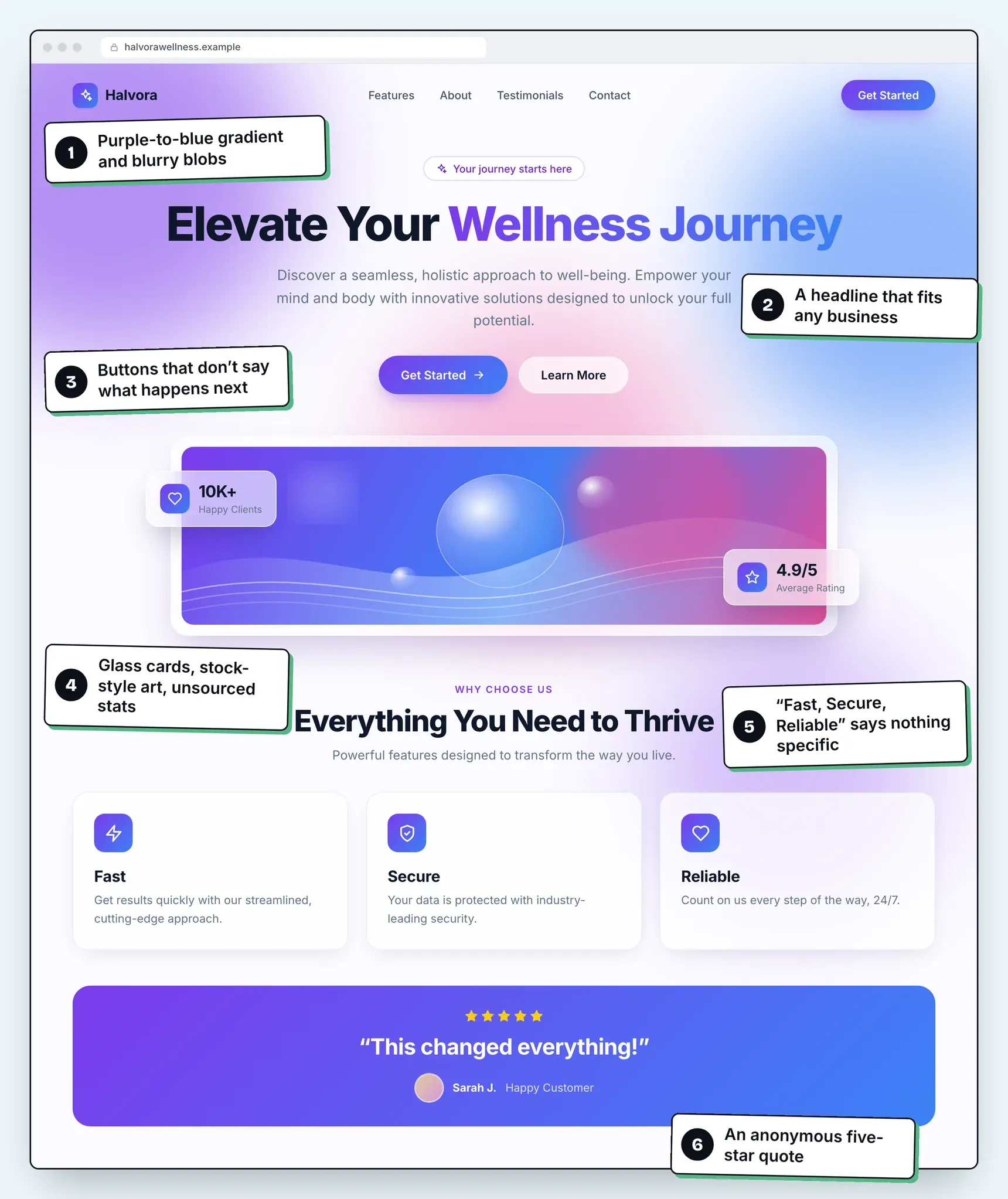
Illustration: a typical AI-generated landing page. Fictional business, made by Southlark Studio for this article.
What to look for, by number:
- Gradient and blobs. Purple fading into blue, with soft colored blurs behind everything. It signals “template” before anyone reads a word.
- A headline that fits any business. “Elevate Your Wellness Journey” says nothing about what this business does, where, or for whom.
- Buttons that do not say what happens next. Get started with what? A booking, a call, a price list?
- Glass cards, abstract art and unsourced numbers. “10K+ happy clients” with no source reads as filler, and the artwork shows nothing real.
- “Fast, Secure, Reliable.” Three icons that every business could claim, so they persuade no one.
- An anonymous quote. “This changed everything!” from “Sarah J.” is impossible to verify, so visitors skip it.
The bigger issue is sameness, and it runs deeper than color. Ask these tools for a dental clinic and a bakery and the two pages may look nothing alike: one light and airy, one dark with a warm glow and a bento grid. Read them, though, and they make the same moves. Vague headlines, unsourced stats, generic feature cards, anonymous five-star quotes and buttons that do not say what happens next:
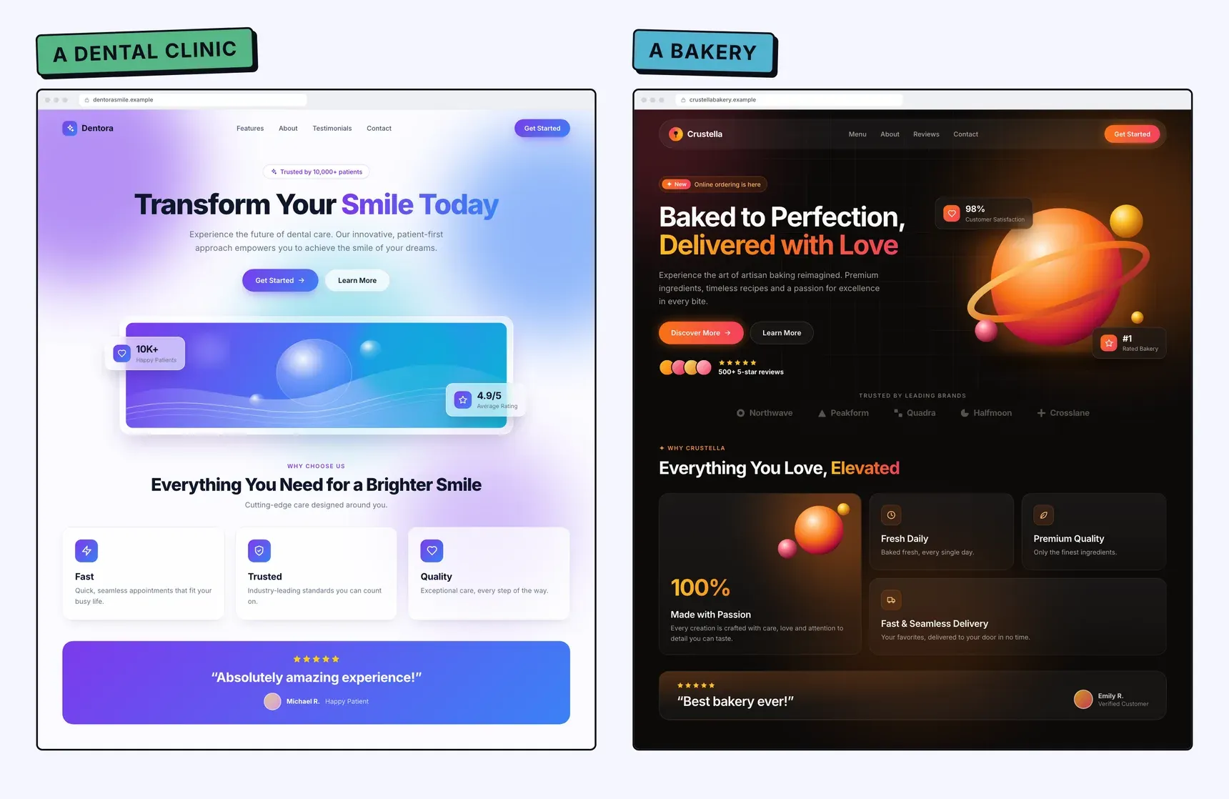
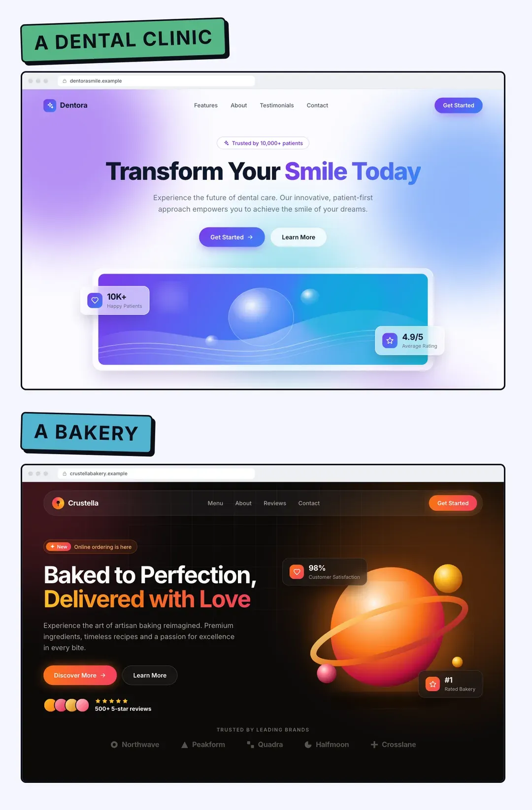
Illustration: two AI-style pages for a dental clinic and a bakery. Different looks, the same tells. Both businesses are fictional, made by Southlark Studio for this article.
A landing page works when it answers the questions your specific customers have, in the order they have them, and gives them one clear next step. That depends on knowing your field, your competitors and why people choose you. A prompt like “make a website for my bakery” cannot supply that. Change the colors and the layout all you like, and the result still reads like the bakery above.
Technical gaps you cannot see
The biggest risk is the work that is invisible from the screen. A page can look perfect and still have problems like these:
Search engines
- Page titles and meta descriptions left generic or identical
- No sitemap, no
robots.txt, or a site that was never submitted to Google Search Console - Missing social preview images, so shared links look broken
- Content that only appears after JavaScript runs, which can make indexing slower or less reliable
Speed and mobile
- Oversized images that make the page slow on a phone connection, hurting Core Web Vitals
- Layouts that break at in-between screen sizes, overlapping buttons, text that is too small to tap
Accessibility
- Low contrast text, images without alt text, forms without proper labels, menus you cannot use with a keyboard
Forms and email
- A contact form that shows “Thanks!” but never sends anything
- Notification emails that land in spam because the sending domain was never set up properly
- No protection against bots, so the inbox fills with junk
The last group is the most expensive, because you do not find out. A form that silently fails looks exactly like a quiet month.
Security and privacy: be careful, not scared
Most landing pages do not store sensitive data, so the risk is lower than for a full app. But AI builders can also generate apps with logins and databases, and that is where mistakes matter.
The main risks are well known: database access rules that are too open, API keys placed where the browser can see them, and sign-in rules that do not check who is asking for what. Lovable deserves credit here. It runs a quick security scan when you open the publish dialog, checks database access rules and warns when you paste an API key into the wrong place. Its own documentation is also honest that these tools “cannot guarantee complete security” and do not replace a proper review.
Then there is privacy. If you add analytics or serve visitors in Europe, you may need a cookie consent banner and a privacy policy that matches what the site actually does. The builder will not decide that for you.
Hosting, domain and DNS
Publishing on the builder’s own subdomain is usually easy. Using your own domain takes more steps: a paid plan in most cases, DNS records at your registrar, SSL, and waiting for it all to propagate. Lovable’s docs, for example, ask for an A record and a verification TXT record, and note that DNS changes can take up to 72 hours.
None of this is hard once you have done it before. The first time, it is an afternoon of help articles while your site is half online.
Who fixes it when it breaks?
Websites are not finished at launch. Platforms change their plans, a third-party script stops working, a domain renewal email goes unread. Someone has to notice and fix it.
If you built the site by prompting and cannot read the code, every fix means another round of prompting and hoping nothing else changes. If you hire a developer later, they first have to understand code nobody on your side wrote or reviewed.
Lock-in: better than you might think
To be fair to Lovable: you are not trapped. It offers two-way sync with a GitHub repository on every plan (GitLab and Bitbucket are supported too), and a code download on paid plans, so you can host the site elsewhere. That is better than many traditional builders.
The practical question is different: if you take the code, can you or someone you trust run it? Owning files you cannot maintain is ownership on paper only.
Your time is the biggest cost
Add it up honestly: learning the tool, prompting and re-prompting, writing the copy, sorting out the domain, testing on your phone, fixing the form. For many small business owners that is several evenings or weekends, time not spent on clients. That number rarely appears in a “build your site for free” comparison.
When an AI builder is the right choice
- Prototypes and idea tests. You want to see if anyone clicks before spending real money.
- Internal tools. A dashboard or form only your team uses, where polish and search do not matter.
- Technical founders. If you can read the code and check the output, these tools make you much faster.
- You enjoy it. Some people like building. That is a perfectly good reason.
Before you launch an AI-built site, check this
- Every page has a unique, specific title and meta description.
- A sitemap exists,
robots.txtdoes not block it, and the site is verified in Google Search Console. - Shared links show a proper preview image and title.
- The page scores well in PageSpeed Insights on mobile, not just desktop.
- The layout holds at phone, tablet and laptop widths, and every button is easy to tap.
- Images have alt text, text has enough contrast, and the form works with a keyboard.
- You sent a real test message through the form and it arrived in the right inbox, not spam.
- The form has some protection against spam bots.
- No API keys are visible in the page, and any database access rules have been checked.
- You have a privacy policy, and a consent banner if you use cookies or analytics that need one.
- Your own domain works with HTTPS, with and without
www. - Analytics is set up so you can see whether anyone actually visits.
- You know who will fix it, and how, when something breaks.
- The domain, hosting and builder accounts are in your name, with logins you control.
If you can tick every box, you did the work, and the tool saved you money. If several are blank, that is where hidden costs come from.
When to hire a studio instead
If your goal is a page that brings in clients, not a project to learn from, it can be cheaper to hand it off. That is what Southlark does: landing pages only, at a fixed price.
We use modern tools, AI included. What you pay for is the judgment around them: studying your field and competitors, writing copy that speaks to your customers, three design directions to choose from, and the checklist above done for you. Plans start at $250, the page goes live 7 days after your brief is complete, and the site, domain and hosting accounts are set up in your name.
Sources
Facts about the tools were checked on their official pages on October 2, 2026: Lovable pricing (plans priced by credits; message cost varies with task complexity), Lovable docs: Security (quick scan on publish, optional deep scan, API key handling, “cannot guarantee complete security”), Lovable docs: Git sync (two-way sync with GitHub, GitLab or Bitbucket; code download on paid plans; self-hosting), Lovable docs: GitHub (github.com sync available on all plans), Lovable docs: Custom domain (paid plans, A and TXT records, automatic SSL, up to 72 hours for DNS), Bolt pricing (token-based usage; larger projects use more tokens per message) and v0 pricing (included monthly credits plus token-based usage). Plans and features change often, so check those pages for current details. Lovable, Bolt and v0 are trademarks of their respective owners. Southlark Studio is not affiliated with or endorsed by any of them.